 Life & Style

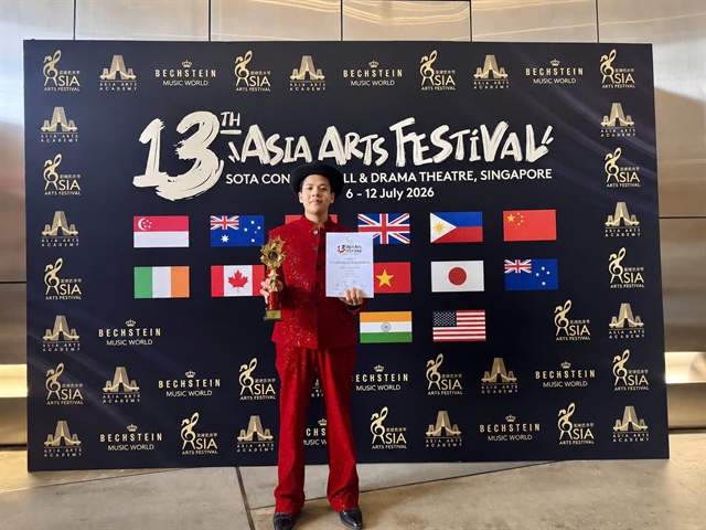
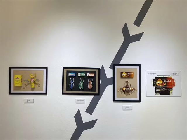
Young Vietnamese singer wins gold at Asia Arts Festival
1.
 |
| Seán Nolan |
HÀ NỘI – Have you noticed? You must have noticed. If you haven't noticed, when I point it out, you won't stop noticing, particularly when you notice a notice on the street.
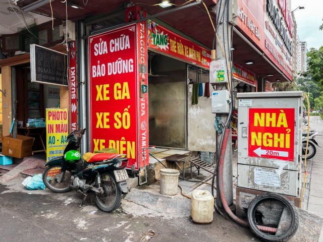
Have you ever wondered why 99 per cent of all Vietnamese signs have the same font? For a country with such a rich typographical history, it seems this rich culture of careful creativity was cast aside when the digital age arrived.
You won't need telling that fonts have never been as important or as popular as they are today, when the thought of handwriting anything other than an urgent note seems ridiculous.
Việt Nam boasts a rich typographical heritage rooted in ancient scripts. The nation's calligraphy, with its graceful strokes and elegant curves, has been revered for centuries as an art form that pays homage to its cultural legacy and visual representation of its identity.
Yet, as Việt Nam rapidly modernises and becomes more interconnected, the delicate balance between tradition and technology has become increasingly relevant.
Despite Việt Nam's rich and varied typographical history, its modern-day equivalent seems a lot more uniform.
So why do those bún chả, phở and nước mía signs look virtually identical across the country?
Most of these businesses use the font 'Impact', and the reason is a mixture of plagiarism, ease of use and habit.
Even today, most font designers don't bother to add tone marks to letters to make their fonts useable in Việt Nam, and when Impact was released on Windows 98, Microsoft did the same.
However, a modified black market version called UTM Impact was released onto the domestic market.
Despite not being authorised by Microsoft, it quickly became popular, given the perception among graphic designers that Times New Roman and Ariel had poor qualities for Vietnamese typefaces, and since then it has been the go-to font of choice for most.
Is the writing going to be on the wall any time soon for Impact in Việt Nam? I doubt it. Even if a grander, greater, fancier font with full Vietnamese character abilities comes along, I think the ship has sailed, and Impact is here to stay.
So there you have it, the secret behind the ubiquitous font that rules the Vietnamese signage kingdom, where Impact has become the unsung hero of visual consistency.
While tradition and technology dance a delicate tango, graphic designers serving the nation's trà đá, cà phê and bánh cuốn sellers have adopted a motto: "If it's not broken, don't fix it...or change the font!" VNS
Life & Style
 Life & Style
 Life & Style
 Life & Style
 Life & Style
 Life & Style
 Life & Style
 Life & Style
 Life & Style
 Life & Style
 Life & Style
 Life & Style
 Life & Style
 Life & Style
 Life & Style