 Brandinfo
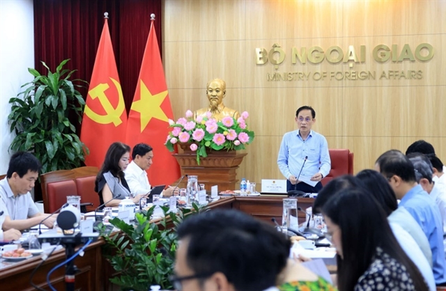
Foreign Minister orders monthly compliance reviews to convert int’l pacts into measurable outcomes
1.
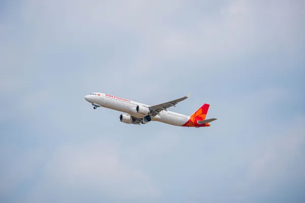
Sun PhuQuoc Airways was born as a perfect piece in Sun Group’s strategic vision to build a premium ecosystem of tourism, entertainment, real estate, and aviation.
With pioneering ambition, Sun PhuQuoc Airways is not just an airline, but a symbol of connection – bringing the world to Phu Quoc and taking Phu Quoc to the world.
Using Phu Quoc as its central hub, the airline is developing a ‘hub-and-spoke’ flight network, directly connecting the Pearl Island with major cities both domestically and internationally. Each flight marks the beginning of a holiday, offering internationally standard amenities, seamless experiences from sky to ground, and emotional imprints rich in Vietnamese identity.
After receiving its air transport business licence, the airline has taken another important step on its take-off journey by officially announcing its brand logo – a visual identity that not only defines the airline’s style, but also serves as a brand manifesto, clearly expressing the vision, mission, and core values that Sun PhuQuoc Airways pursues: connecting emotions, Vietnamese identity, and international experiences.
The Sun emblem
SPA’s emblem is the crystallisation of its brand philosophy and mission of global connection, as the pioneering resort airline in Viet Nam. At the centre of the logo is the Sun – a symbol consistently present throughout Sun Group’s ecosystem. It also represents the philosophy of placing passengers at the heart of every sustainable development initiative and service innovation of the airline.
Surrounding the Sun are nine stylised, soft petals rotating clockwise, symbolising positive energy and a journey of continuous forward movement.
These nine petals represent nine service qualities: telling the story of a perfect journey starting with the foundation of Safety and Integrity, nurtured by a heart of Dedication, Empathy, and Refinement, and leading passengers to experiences of Exclusivity, Creativity, Connection, and ultimately, Elevation of emotions.
Each petal is also a connection – a delicate touchpoint along the flight journey with Sun PhuQuoc Airways:
• Nine connections: Destinations; Culture; Travellers; Experience; Emotions; Community; Future; Ecosystem; Vietnamese Aspirations
• Nine touchpoints: Touching emotions; Touching essence; Touching identity; Touching the heart; Touching aspirations; Touching relaxation; Touching uniqueness; Touching class; Touching the destination.
The primary colour of the Sun PhuQuoc Airways logo is Golden Yellow, clear like sunlight – representing warmth and positivity. When applied to the aircraft fuselage, this emblem transforms into a modern metallic golden-orange, radiating like sunlight. Notably, the connecting stroke of the letter Q in 'PhuQuoc' is shaped like an island rising from the sea, evoking Viet Nam’s Pearl Island.
‘Taking off’ from identity – ascending through enriched experience
 |
The model that SPA follows is not merely one of transportation, but a journey of experience designed seamlessly from sky to ground. Every moment on board is a subtle imprint, crafted with heartfelt attention and genuine care.
According to its roadmap, after announcing the brand identity logo, Sun PhuQuoc Airways will proceed with the next crucial steps – aiming to open ticket sales in October this year and operate its first commercial flight as soon as possible.
Brandinfo
 Brandinfo
 Brandinfo
 Brandinfo
 Brandinfo
 Brandinfo
 Brandinfo
 Brandinfo
 Brandinfo
 Brandinfo
 Brandinfo
 Brandinfo
.jpg) Brandinfo
Brandinfo
 Brandinfo
 Brandinfo
.jpg)