ATR sees strong growth potential for regional aviation in Việt Nam
1.
Last week, Việt Nam News asked readers about signboards in Việt Nam after Hà Nội authorities decided to equip shops along the renovated Lê Trọng Tấn Street in Thanh Xuân District with uniform sign boards with the aim of creating a new model for an orderly street.
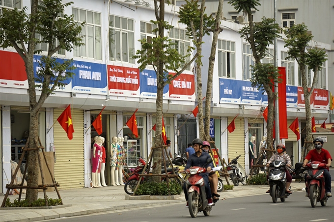 |
| Lê Trọng Tấn Street in Hà Nội. — Photo dantri.com.vn |
Trang Phạm, Vietnamese, Hà Nội
In Việt Nam, it is easy and interesting to see signboards with different designs, colours and even languages on every street in Việt Nam. Billboards and signboards are designated based on the services and products that shops provide. In other words, how the signboards look somehow affects the very first impression of passers-by. Thus, it might be good if each shop has a unique signboard, which helps people distinguish between shops.
The thing is, some take advantage of signboards to catch people’s attention using huge signs, which have adverse impacts on the city’s aesthetics. Therefore, the only thing that should be changed is that the size of all the signboards should be the same.
That is a reason why many criticise billboard uniformisation on Lê Trọng Tấn Street in Hà Nội. All the signboards must have the same size and the same colours. It has received a lot of criticism, especially from shop owners. Obviously, the use of uniform billboards kills the creativity and identity built into many years of developing brands. Passers-by not only cannot recognise the shop, influencing the shop’s income, but it will also take a lot of time to find the shops.
I studied in the UK last year and to be honest, I was not impressed with signboards there. They are simple and not as colourful or customised as those in Việt Nam. However, their sizes are normal, not so big like some signs in Việt Nam.
John E. Bolog, USA
I visited Việt Nam in 2007, teaching English in Buôn Ma Thuột for three months. I humbly do not wish to criticise your beautiful Việt Nam, but the most environmentally friendly answer is to not permit any large billboards.
My home state, Vermont, permits merely one small, state-regulated sign, not to spoil our beautiful scenery. I hope to visit your good country again in the near future.
Andrew Burden, Canadian, Hà Nội
I took a photo at the north end of Hoàn Kiếm Lake with connected signs displaying Dunkin’ Donuts, Popeye’s, Domino’s, Burger King and KFC.
It is good Việt Nam embraces globalisation, diversity and innovation. That doesn’t mean you should abandon tradition in a reckless manner. One of your many attractions is the daily chaos. Around any corner is a wedding (or funeral) tent or dancing dragons welcoming the opening of a new shop. Bring that on!
Killing creativity for the sake of uniformity is like using a fire safety blanket and smothering a child during a cool winter night’s sleep. The intentions are good but the results are fatal. Let each store, street and local market decide signage.
I would prefer to see local Government concentrate on planting more trees, encouraging bicycle use and prevent flooding during heavy rain. Let business and customers decide the rest.
I grew up bilingual in Montreal, Quebec, Canada. In grade 5 the provincial Government changed the law (Bill 101) to make all signs French with English ½ the size. That was one reason for me to leave. I know what art, music and signs I like. Borrowing from the Beatles: “Let it be.”
Huyền Thu, Vietnamese, Hà Nội
Signs are everywhere in crowded streets of Hà Nội. The signs aren’t ugly themselves. What makes them look ugly is the way they are displayed, which is quite disorganised.
The signs have all kinds of forms, sizes and height levels because the business owners have their unique designs, and the investment they put into signs at different places is different too.
To improve the view, the signs should be made in similar sizes and hung at similar heights. But the same color is not necessary; and the original design, which reminds people of the brand owners, should remain. The change should be evaluated after a few months, to see how it affects profit and customers’ convenience.
Setsuko Kon, Japanese, Hà Nội
I don’t feel that signboards in Việt Nam are untidy or disorderly. Maybe the situation in Việt Nam is similar to in my country, Japan. You can see signboards in Japan, from small boards to huge boards, from analog boards to electric or smart signboards. I think it is very convenient that the signboards display addresses here. We don’t have that in Japan. When I find a good shop or restaurant, I try to remember its address. It makes it much easier to learn about the city. I think the colours that are used on signboards are very simple, like primary colours. Most of them are blue, red and yellow. In Kyoto, a very old city in Japan, we have restrictions on sign board colours. It is a bit too strict, but I don’t think the primary colours suit a city like Hà Nội, where there are many historical old buildings and big roadside trees.
Anyway, signboards in Việt Nam are very eye-catching. — VNS